The new minimalism
Soft, bright and warm
"The best way to find out what we really need
is to get rid of what we don’t."
Marie Kondo, Tidying Expert
When the show “Tidying up with Marie Kondo” flickered over Netflix in 2019, just about everyone was infected with “if it doesn't spark joy, throw it away” fever. People tidied up, cleared out, threw away and suddenly had more space in their own four walls than ever before. The principle is not new, however, and the first subtle indicators of minimalist architecture appeared as early as the 1920s. There, however, it was not called the “Konmari method”, but simply “minimalism”.


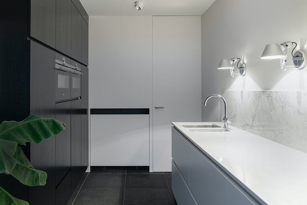
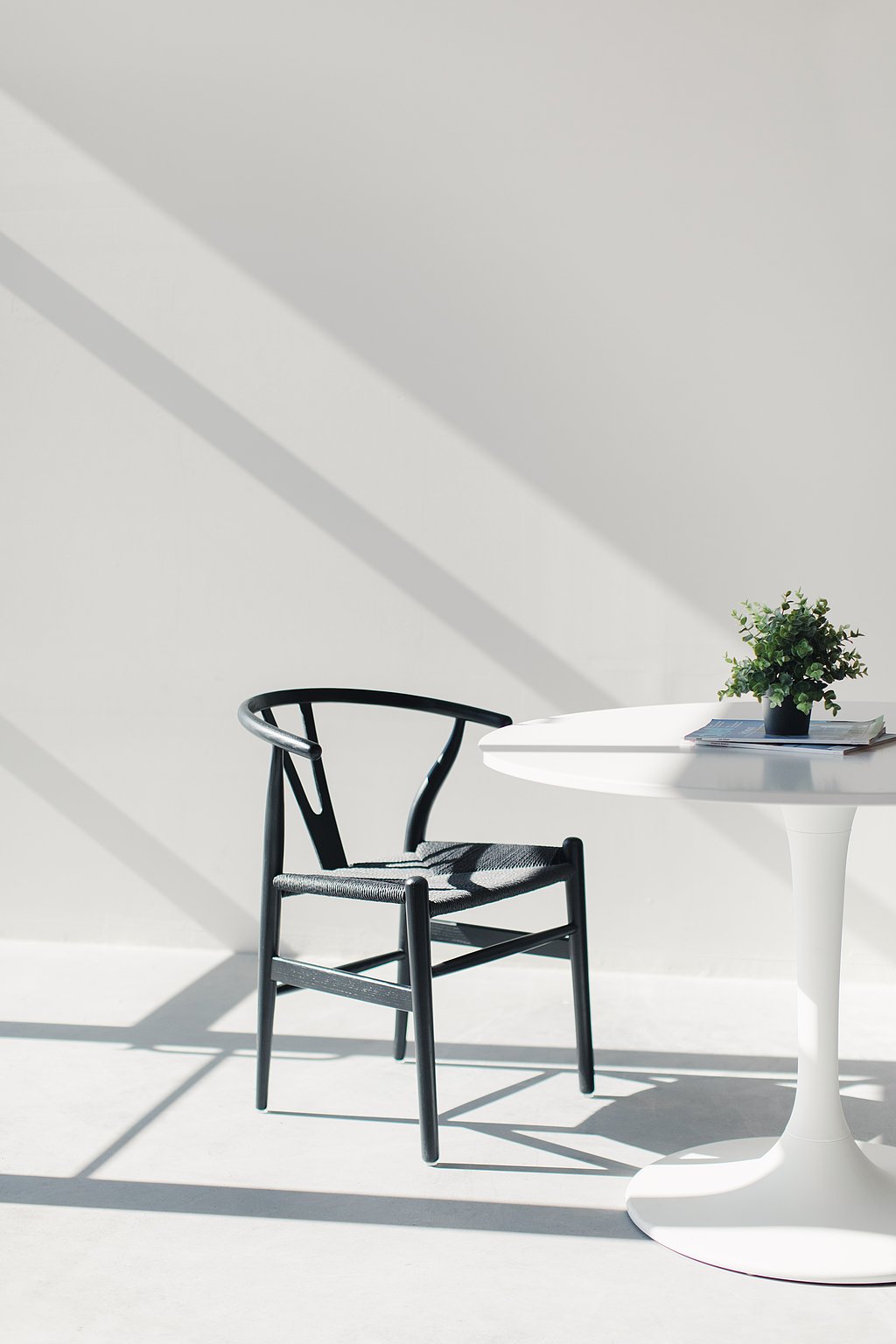
Minimalism, as we have known it for decades, is comprised of white, gray and black. There may be concrete accents or glass accessories incorporated into the aesthetic. But, that’s it. White is definitely dominant. A lot of space, a lot of undecorated walls, everything has its place; every little thing is arranged neatly and thoughtfully, just not too much, just a little bit; a quantum of comfort in the white-out. Minimalism requires a lot of space, a great sense of order, and a lot of money and is therefore often equated with luxury. Yet, minimalism comes from a completely different mold.
Emotions or depersonalization? It doesn’t matter, the main factor is art!
In the 1960s, there were two major trends in art: minimalism and abstract expressionism. Abstract expressionism known as "action painting", is the uncontrolled, spontaneous and highly emotional hurling of colors onto huge canvases and is colorful, wild and loud. Minimalism, is in extreme contrast to this. Minimalist art is objective, logical, clear and concise – a depersonalization as a counterpoint to the emotional explosion of colors. It is precisely this that prepares the ground for architecture and interior design. The emergence of the simple living trend also further fueled minimalism where people try to live with as few possessions as possible, as plainly and simply as possible, and producing little to no waste. Minimalist furnishings practically emerged on their own.
Away from excess, towards the meaningful
Minimalism has been a major topic in the interior sector since the 1980s and has evolved again since 2020. Chaotic conditions on the outside as well as a changed world order led people to create order for themselves: Order outside creates order inside, so the theory goes. In addition, there was suddenly money available that might have previously been spent on travel. People took this money and purchased new furniture – high-quality pieces that brought character to the room – and combined them with a few but meaningful accessories. This resulted in having "the right amount of things" or a "gallery look at home."

Soft and warm
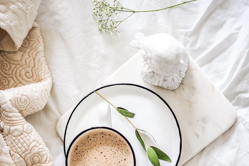
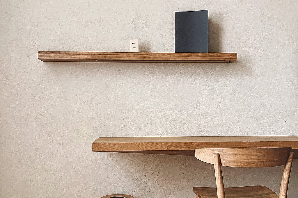
Minimalist interior design is still very much in vogue. In Warm Minimalism, however, pure white is replaced by off-white tones; black and gray are replaced by natural and earthy tones. The color scheme of modern minimalism integrates the Scandinavian interior design style with the minimalist trend thus creating a very special sense of space – somewhat less contrasting or playful than hygge – in itself. Various objects in the room in a range of soft and warm colors provides a pleasant and tidy atmosphere, and at the same time homey and cozy feelings.


At Schattdecor, we took a look at Warm Minimalism and realized: Warm, earthy tones are the order of the day. The quieter the color scheme, the more focus can be placed on texture. Fine textures on basically calm surfaces emphasize the character of the room, the pieces of furniture in it and give the room even more meaning.
Our decor recommendations
Blaustein (14-54173-004)
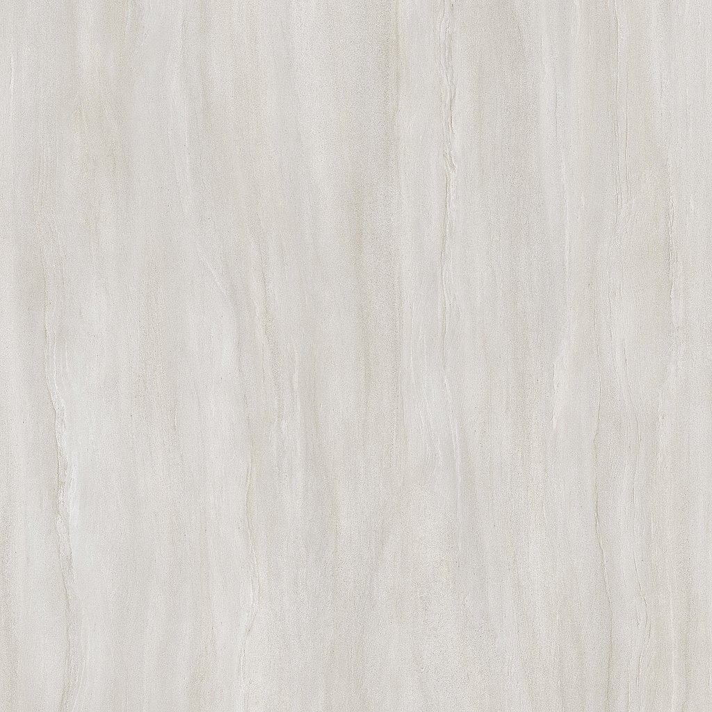
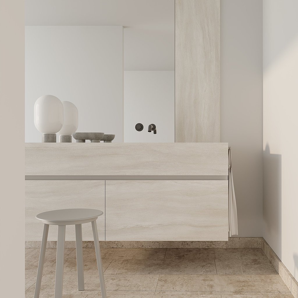
Blaustein in a cream-colored version is extremely suitable for kitchen countertops or in bathrooms on walls or floors. Light tones add a pleasant cheerfulness to bathrooms with limited natural light, which is difficult to achieve with pure white.
Fine fossil inclusions make Blaustein a stone decor in which, for all its minimalist tidiness, one gets the feeling of being able to read many small stages in the earth’s history - vibrant and exciting.

Oceanside is the name of a stone decor that has a beautiful play of light and dark color inclusions. The structure is reminiscent of quartz on the one hand and the streakiness of wood on the other hand. Overall, the layout appears very restrained due to its fine veins.
The varied shades of white and beige give space to the structures. This makes it cozy without a lot of accessories. The distinctive lamp looks like a sculpture and completes the gallery look.
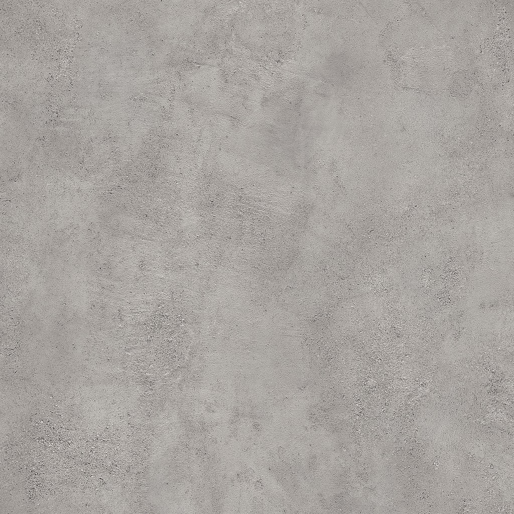
Here’s a concrete look that has no equal! The decor is reminiscent of the surface of the moon through irregularities created in the preparation using a trowel and mortar. Moon completes our décor trio for the new, soft and warm minimalism. It is particularly suitable for countertops and bathroom surfaces.
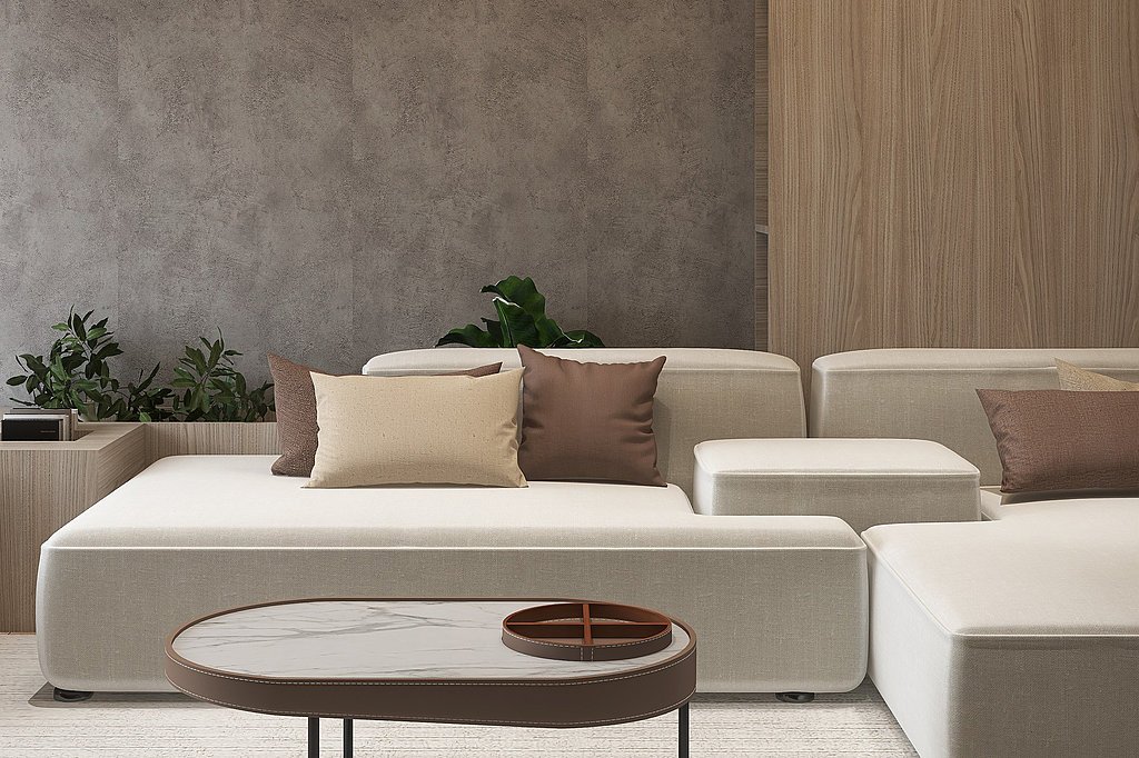
Gran Sasso Chestnut in a light color scheme combined with Moon in a gray coloration is a classic combination that can be used in a versatile way in interior design. Here it is used to combine a sofa in off-white and accessories in brown and beige. The table is the standout here and completes the minimalist look.
